31 March 2012

Week 61 Lucky Dip

Being the fifth week of the month we have our "Lucky Dip"
We have chosen a
Picture Inspiration
 for you from the fabulous 
Design Seeds
It is a wonderful source of colour combinations.


We always choose a guest designer for this week and this time 
our wonderful LIMette Jenny is our guest.


Lots of you follow Jenny and you obviously love her work as you leave her lots of FAB comments She is a constant source of inspiration to all of us.
Here she has made this fabulous card ... a reminder of our youth, with a daisy chain.

Chrissie

This card is based on a sketch I used last week and utilised a Blockhead stamp which I coloured with markers, two shades of pink for the head and green for the stem. It's mounted on Nesties and is sitting on a band decorated with Pink Petticoat harlequin DP.
I made the banner with a  Spellbinder's pennant die.
This is how I did it.

  • Stamp the sentiment and arrange the die with a long tag on the side nearest the die cutting machine.
  • Roll the die part way through the machine stopping before it has gone through completely, then wind back.


  • Remove the die and place it around the other end of the sentiment, once more putting the V shaped end through the machine first and only rolling part way along the die so as not to cut through the middle of the sentiment panel.


  • Score two lines equidistantly at a .5cm interval either side of the sentiment and fold mountain and valley to make the banner

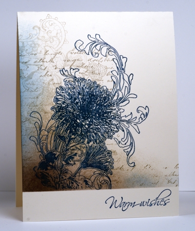
This is back to my favourite inking technique. The bottom of the card was masked with post its and the inks, Pear Pizzaz and Basic Grey, were added with Ink Duster Brushes. I stamped some text in the green shade and then added the blooms (Unity stamps) with the addition of a dash of pink!
The sentiment is from Paper Make Up.
I almost gave up when I added the grey colour as it seemed to look dreadful, but I continued and the addition of the images transformed the whole look of the card... so don't abandon hope too soon if you try this technique, if you persevere, things often turn out better than you might think!

Mandi


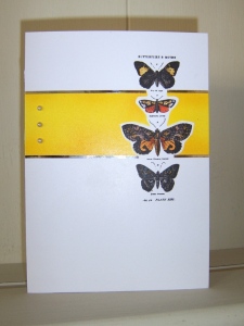
My first card came together instantly! I stamped the Butterflies sentiment from a fabulous set my lovely Chrissie bought me last year for my birthday. Ashamed to say this is the first time I'd inked it! It is Katzelkraft Isabelle Norris English Quotes KT250.

I stamped using Stazon Stone Grey, then stamped with Versamark, the harlequin from a Tim Holtz set French Market. I heat embossed with WOW Neutral Ultra Shimmer Glitter embossing powder. So hard to photograph, but it is so lovely and glittery. I then took a Stampin' Up Pretty in Pink ink pad and using a dauber I sponged the ink in the right hand corner, out to the bottom edge and right hand side. Along the left hand edge, I drew a glue line with my Zig glue marker and sprinked with Glamour Dust. To finish I added the Martha Stewart punched butterflies. Colours are Stampin Up card Pretty in Pink, Pink Pirouette and Certainly Celery, lastly I added a few pearls.


For my second card I stamped the green spotted strip with Stampin Up Borderlines in Certain Celery. Then I Stamped the square Solid Stripes, also Stampin' Up and heat embossed as above.
I hand drew the stalks. I wanted a modern funky look, so thought the freehand would have worked.. However I didn't like it. So I redid it using strips of certanly celery card for the stalks..then didn't like that much either...


Can see these ending up in the bin!

The Hero Arts flowers are from a set, the flower heads are in squares, therea re 4 designs. ~Again stamped in Stazon Stone Grey, watercoloured with pencils. The sentiment is a retuired SU one. 

If I could have a last shout out for anyone wishing to join my
Stampers 6 Club
Starting April 3rd
Only ONE place left

Please email me for further details
UK residents only please


30 March 2012

ShowCASe Week 59

Another week of fabulous submissions and time for another ShowCASe.
This one is slightly different as this week includes our first showCASed LIMISTER!
Neil is one of that rare breed of male crafters and I'm sure you'll agree that his work is fab.
Without further ado here are this week's choices.


S1052516


We're sure you'll agree that once again we have a fabulous selection of wonderful work to ShowCASe!
DO please take our ShowCASe badge from the page at the top to display on your blogs, and well done everyone!

24 March 2012

Week 60 Recipe

Last week's challenge really got some of you thinking and we had some super submissions. 
It's odd how often LIMettes seem to second guess us and submit a card which would also fit into the following week's challenge, we think some of you must be mind-readers. 
This week we're giving you the chance once more to combine themes and
Take Three Challenges
For this challenge we'd like you to choose any three of our past challenges and combine the criteria from them on your card. There's a list of all of our past challenges in the page at the top of our blog.
When writing your post about your submission, we'd like you to identify the three challenges, with week numbers, that you have included in making your card. There's also a page with past sketches should you wish to include one of those in your creation.
We have done this once before and it was great fun, so we hope you'll enjoy it again.

Mandi


For my first card I used a Marian Emberson stamp, stamped in VersafineOnyx, Gems added to the flower heads. Then sentiment is Pink Petticoat
Extremely simple
The challenges for this one are:
Week 12 Off Centre
Week 24 Circles [under the gems!]
Week 42 Bit of Bling


I made this for a couple I know, marrying for the second time. New beginnings. I think the butterfly is quite appropriate for ths occcasion.
The butterfly die is Stampin Up Beautiful Butterflies and the little flowers are the Itty Bitty punches. Sentiment, again is Pink Petticoat;

The challenges for this one are are:
Week 14 White on White
Week 16 Butterfly
Week 55 Die cut
Week 56 Don't Scrap It

I still have ONE place left for my Stampers 6 Club starting April 1st. [Order placed by 3rd latest]
There is a promotion throughout April, where you can achieve FREE goods. Then even more exciting we have a new mini catalogue coming May 1st...
Please contact me if you are interested, or would like more details.
Overmoores@aol.com

Chrissie

I've been playing around with ink again... it's a bit of a habit.
I began by stamping the flowers (SU Paisley Petals, a gift from my lovely friend Mandi) using Versamark and then embossing with WOW Silver Pearl EP.
I then inked the rectangle with Iced Spruce Distress ink using an Ink Duster brush. Using a water brush I highlighted part of the images using the Distress ink. I dab the ink pad onto my glass mat and pick up the ink from that, using it as a palette. All sorts of other images got stamped then... all using the same ink, some done directly, some after I had stamped it on scrap. These were mainly Tim Holtz stamps.
After cutting the rectangle into three equal sections, I inked the edges, mounted them onto a black background and  finished it off with a line of birds from my Martha Stewart punch and  added a computer generated sentiment.
The challenges used were

  1. Week 15 - Embossing
  2. Week 23 - Something with Legs
  3. Week 44 - Green

My second contribution uses some rescued components from last week's challenge. The woodgrain and script stamping was cut from a one layer card that was slightly off square and mounted onto this one with the Memory Box die cut added.
The sentiment is from Hobbyart


The challenges for this one are

Week 12 - Off Centre
Week 55 - Die Cuts
Week 56 Don't Scrap It
Week 57 - Neutrals


We'll look forward to your combinations of challenges... Have fun!


ShowCASe Week 58 OLC Script

This was another very difficult week for choosing our showcase; we are fortunate in having so many consummate crafters among our number.
SO without further ado and in no particular order here are our choices for this week.


limscriptcake1a 
 
 
We're sure that you'll agree that these are wonderful examples of the work submitted last week.
Congratulations everyone, do please take the ShowCASe badge from the page at the top to display on your blogs.
DO come back for our new challenge in the morning.
Chrissie will be at the NEC tomorrow... if you see her with her large LIM badge and tote, do stop her to say hi!

17 March 2012

Week 59 - Theme

We were delighted that there were so few posts with Word Verification this last week... thank you everyone who removed it from his/her blog. It makes a huge difference to us. Thank you!
 For our theme this week, we have a technique which was pre-empted by many of you last week, we would like to see some evidence of
MASKING
but we still need to see white space and a clean and simple design.

This card employs three images from Blockhead stamps. The bulrushes were coloured with Promarkers and the heads have had fun flock applied, although it's difficult to tell from this picture. 
The larger of the two butterflies was obviously the one which was masked. 
The sentiment is from Stampin' Up.


This one has a horizontal masked  band, which was inked with Bashful Blue and Almost Amethyst, using duster brushes. It was then simply stamped with the Penny Black tree and the Tim Holtz birds on a line. Easy Peasy lemon squeezy!


Mandi


Boy, I had SUCH a hard time for this week! Despite being a SU demo I don't do that many stamping techniques, I do what I do, if you know what I mean! I rarely mask, hence... struggling!
However, here's what I did.
Les Miserables is my FAV musical, as it is for my friend Chrissie and many of you I guess. I love this stamp set and decided to replicate the Les Mis scene that represents the show. [The make escapes me, I will amend the post once I sort out whose it is]
I firstly stamped the girl, Cosette, onto my 6x6 card blank. I then made a 'stencil' mask for the torn flag behind. To achieve this effect I had to mask the girl using paper. Paper works best as card is thicker and likely to make a line in your design. I hand drew and cut the idea of the torn flag. Very crudely done, but I think you get the overall effect.
So I had 2 forms of masking, one with the girl and the other with the stencil.


We're sure that you'll have lots of innovative ideas and can't wait to see what you produce.

ShowCASe Week 57

A bit later today, but, here are the showCASe entries from 
Week 57 Colour 

We have such a hard job choosing a selection as there are so many to choose from...thank you
It's great to see how so many of you are becoming more and more comfortable with the CAS genre and enjoying it too.

Please display our showCASe banner on your sidebar, from our page at the top.


Thanks again, see you tomorrow for our new challenge


10 March 2012

Week 58 One Layer - Script

Everyone's favourite... the One Layer Card!
Actually we think that some little time ago the thought of a One Layer Card struck fear into the hearts of many LIMettes, but we know that quite a few crafters now really enjoy this genre and make some stunning projects.
This week we'd like you to include 
Script
This includes any text, not just handwritten styles, but must be in addition to any sentiment you might decide to add.
If you have no suitable stamps, you could always resort to your own handwriting (Shock Horror!).

Chrissie

This is a similar design to one I have made previously, but this is obviously a one layer version, which is a little more complicated to construct.
I cut a mask with a Stampin' Up heart punch and used the negative part to stamp through with the lacy stamp in SU white ink. I then used the punchie itself  to mask the white heart whilst I stamped the script in black, which was then heat embossed.


This one began with the stamping of the woodgrain using an Impression Obsession stamp, off the edge of the card. I overstamped this with the Stampin' Up  French Script  in Soft Suede and followed that with an Artemio stylised flower. The sentiment is from Hero Arts.


Mandi


and bling is back.....breathe!
Easy peasy for me. The fabulous stamp is by Butterfly Kisses Chic Background Stamped in Versarmark and embossed with WOW Princess Pink....scrummy! It is, as I said last week, THE best embossing powder, it stays just as sparkly once embossed and doesn't fall off or overheat, as I found with older powders from years back. The rhinestone embellishment is from Hobby House yawn, I know I use them all the time!! And a feather from my stash.
Here is a close up... I was trying to show you how crisp and sparkly it is, but I'm not sure if you can see it in this shot.


Can we give another little mention regarding Word Verification. We politely ask you to disable this feature.You do need to be in the older style of Blogger to do this, (instructions are on our Help page above). It does make for ease for commenting for everyone, especially us, as with over 200 comments most weeks, trying to decipher the fuzzy letters doesn't aid our already full schedule or our frustration when we get it wrong. You can make the comments subject to  moderator approval if you are worried about what may be published, but Blogger's new Spam filter is very efficient.
From this week we will add WV at the end of our comment if Word Verification is present, as it has been drawn to our attention on numerous occasions that sometimes authors don't even realise that WV is operational on their blogs!

Have a great week, happy crafting!

09 March 2012

Scrap ShowCASe and February Winner

Once more there was a plethora of wonderful cards to choose from for our 'Don't Scrap It' ShowCASe!
It makes us realise what a creative bunch LIMettes are and choosing is so satisfying but sadly we can't showcase everyone, so here are our choices for this week.


We're sure that you'll agree that all of these are simply stunning! DO please grab the ShowCASe  badge from the page above the display on your blogs .
Wonderful work, thank you everyone!
Now for our February winner and we're sure that that this one will be really popular with you all. This lady has been a faithful LIMette practically from the beginning and  produces the most wonderful contributions each week. Her family needs a few positive vibes at the moment so do please visit and give congratulations and all good wishes to 
Cards from Lynne's Loft
We'll arrange for your prize from the Craft Room to be sent to you.

Congratulations Lynne, a most worthy winner.

Do join us tomorrow for our new challenge.

03 March 2012

Week 57 - Colour


It's the first week of the month (Gracious, it's March already) and so we've got a colour challenge which this week is
NEUTRALS
This could be anything from off white to black with any shade of beige, brown or grey in between.


We are delighted to be sponsored this month by


WOW! Embossing Powder has been established as a brand since May 2006 and has grown dramatically since then. We are rapidly becoming very well-known and respected within the craft industry. We pride ourselves on our fast and friendly customer service, and personal touch each and every one of our customers receives. We are the largest manufacturers of embossing powder in the world, therefore are very pleased and proud to offer crafters what we believe is the best product available at a great price.


WOW! Embossing Powder offer over 160 different colours of embossing powders: Embossing Glitter, Metallic, Puff and Ultra High to name a few collections.  WOW! also sell Fab Foils, embossing inks, embossing pens, bonding powder, flock, stamps and stamping accessories.  

The lucky winner will receive a caddy containing 12 varied WOW embossing powders!!


I decided to use kraft for my first card. I stamped the Agapanthus, from the Kanban set again which I used on my personal blog the other day. It's a super little sheet, available from Create & Craft only at the moment, I think. I stamped on the reverse of the ribbed kraft card with Versamark then embossed in WOW Pepper embossing powder. For any of you that dont know, WOW embossing powders, are fantastic! I never used to be a big fan of heat embossing, but WOW powders have changed my mind competely. Whatever they are made of give a superb finish, they seem finer somehow and are available in THE most gorgeous colours!
Holding a dark brown piece of paper the same size as my kraft panel, I tore the bottom, then placed with the brown just down slightly. I prefer the ripped edge to be roughly the same shape. I roughly coloured the heads of the Agapanthus with a Chocolate Chip marker pen.
The brad is Stampin up, poked through, then Linen thread, also Stampin' up wound round the brad, then secured behind before sticking. The sentiment is from You are Loved, again Stampin' up.


For my second card I took my layout inspiration from our Neutrals colour block.
It is nothing like I planned in my head! How often does that happen!!
Looking at the photo, I planned my squares, roughly first on paper, then cut to size, in Chocolate Chip, Whisper White, Crumb Cke and Sahara Sand. I then used Stampin' Up French Foliage and embossing folders [Swiss Dots and Square Lattice]to create different textures. This again is heat embossed in Pepper.
[As you can imagine, all my other powders are all sparkly and shiny, SO not Neutrals week!]

For any Stampin' Up products or if you would like to join my Stampers 6 club starting April 1st, please contact me Overmoores@aol.com
Only 3 places left!

Chrissie
I decided to do a card using some embossing powder from WOW!
For this I stamped my Blockhead Paper Arts tulip image with Versamark and then embossed the image with WOW Pepper Embossing powder. I applied bleach to the image using a water brush.  It's amazing the different effects which result from doing this... it's largely dependent upon the type of paper or card used. This one was quite successful... some don't have such a dramatic effect. I added a little depth to the flowers by colouring the dried image with some Derwent Inktense pencils and blended the colours with a water brush (no bleach this time). It's mounted on an SU Sahara Sand card base and framed with a piece of cardboard cut with a Nestie. I lengthened the aperture a little to accommodate the size of the image.
This one is another stamp from the same set, with the same treatment, this time on black paper, with black embossing powder and no additional colouring. The picture isn't terribly good. I'll have to try and take another, but the bleached paper is just about the same colour as the Sahara Sand card.
As ever there are a few more examples on my personal blog, do take a look, I love to receive visits from you!