Showing posts with label Week 241-250. Show all posts

05 December 2015

November Winner

Hi there LIMettes!
WOW! Not only has another month zipped by in a flash
but we are almost skipping into a new year too! 

That's a mountain of wonderful creations you have delighted us with
and today we are announcing our winner for November!

Generously sponsored by 

November Sponsor

Our super loyal and lucky winner for this one is 

Viv

Viv has been supporting and entering our challenges forever and even
enters more than once a week. It never ceases to amaze how she finds the time 
and energy combined with other entertaining activities described in her cheery posts.
She certainly knows how to party as well as create stunning and inspirational cards.

We love your work Viv and hope you'll continue to support our challenges.

Congratulations and please contact us by email for details of how to claim your prize
LIM2011@gmx.com

There's a winner's badge waiting for from the page link at 
the top of the blog. We hope you'll 'wear' it with pride on your blog!


27 November 2015

Santa ShowCASe Week 250

SHOWCASE Week 250
What fun cards were submitted for our Santa challenge and it was a delight to choose our showcase for this week!
Even the ONE LAYER element didn't cause too much trepidation it seems, as we had some terrific submissions!
Without further ado, here are our choices!

What amazing colouring! If you haven't visited Rachel's blog, we would urge you to do so, you won't be disappointed with her fabulous work!

What perfect use of white space and immaculate stamping !
Just beautiful!

Deepti has achieved such a vibrant scene with her exceptional inking and stamping!
What a fun card!

Congratulations ladies, please take the badge from the page at the top to pop on your blogs with our thanks.

There's just a little time to join in our numbers challenge which ends tonight and don't forget to check out our new challenge tomorrow at 8am GMT!

20 November 2015

ShowCASe Week #249

Morning all, it's time for another ShowCASe following our

FIRE-coloured Challenge

Those colours definitely seemed to inspire you LIMettes!
There were so many striking and vibrant cards to enjoy looking at.  
We've narrowed the choices down but could not choose between these 
- so, in order of entry, it's a Top 4 this week!

We hope you'll agree these are simply awesome and worthy of our showCASe!

 The plaid that Rema created using fiery colours is clever, but then to die cut 
and inset to create a CAS design with lots of white space is sheer genius. 
 Love the overstamped sentiment!


Stunning colouring of a timely poppy, the rich, fiery shading and
 the off the page image make a striking card!


The strong colours worked really well for these feathers, 
perhaps they are from a mythical phoenix?   
Nicely balanced design with plenty of white space!


Sylvia-Anne
This sunset is a real piece of art, what clever blending of inks, 
set off to perfection by the silhouette in front!


Huge congratulations ladies and please take a ShowCASe Badge
from the page at the top - we'd love you to 'wear it with pride'
on your blogs and thank you for your continued support of 
Less is More!


There's still a little time to join our one layer Santa challenge 
which ends at 10pm GMT tonight then we'll be back with a
new challenge tomorrow morning at 8am GMT!


14 November 2015

One Layer Week 250

It's back to
ONE LAYER 
cards again this week and we have a super fun theme for you to adhere to!
It's SANTA!

Do remember to leave lots of white space and do keep your designs really simple!
Here are our cards to give you a few ideas!


I bought this fun stamp from Little Claire, at Sincerely Yours show when I was out and about with Chrissie.  I've coloured him with Koh-i-Noor pencils on kraft card and added a sentiment from Dylusions.

I love Penny Blacks ducks and this one is a real cutie. It was coloured with Distress Inks and  a water brush and accompanied by a computer generated sentiment, which reads... What do you get if you cross Santa with a duck?   ... a Christmas Quacker!


Sarah

Santa falling down the chimney is an old wooden stamp that's been
in my stash forever and I've used various sets by Clearly Besotted, 
Uniko and Paper Smooches to create the colourful explosion of gifts and images.


This card took a bit of planning but was pretty simple to create.  I sketched a Santa hat onto a post-it note and cut it out from the inside to create a mask, firstly minus the white parts.  I used a grey card base as I wanted the white to eventually show up.  I blended Barn Door Distress Ink through the mask to add some light and shade.  I then cut two more masks for the fluffy parts of the hat and swiped a VersaMark ink pad over the negative space onto my card base.  I then heat embossed these areas with white powder by Wow!  I finished with a sentiment from MFT Christmas Cuteness.

We are really looking forward to seeing what you all come up with and just think, it will be one less card for you to make when the time comes for you to send out your own Christmas cards!

***


13 November 2015

Paper Piecing ShowCASe

ShowCASe  
Week 248

We have another group of deliciousness for you today with our 
Paper Piecing ShowCASe
Without further ado here they are in the order which they were submitted.


We thought Tara's paper piecing of this comfy pile of blankets was just fabulous.  Paired with the crisp stitched panel makes this perfectly CAS.
We loved the sentiment and Susan's fantastic paper pieced image.  The colour blocked design also made this a really striking card.
Joyce
Such a fabulous scene for Christmas.  Those images look wonderful after being paper pieced and Joyce managed to keep her card beautifully CAS even with the bold two-part sentiment.

What a wonderful bunch!
We're sure you'll want to join with us to congratulate these ladies on their wonderful inspirational work!
If you haven't visited them already it would be great if you could pop by their blogs to leave a few kind words! 

DO please take the showcase badge from the page at the top!

There's still a tiny bit of time left to join in with this week's FIERY colour challenge, but do come by tomorrow for our new challenge starting at 8am GMT.

11 November 2015

October Winner

Hello LIMettes, another month has whizzed by 
which means it's time to announce our winner for October!

Our generous sponsor for the month was 

October Sponsor

and our winner is 

Maaike of  Cards by Maaike

Maaike never seems to miss a challenge, producing fun, striking and
inspirational cards week after week! What's more she is always zipping here 
and there with a friendly comment for her fellow LIMettes, offering 
appreciation and encouragement every time.

We're sure you'll agree that Maaike is a very worthy winner.
We always appreciate your contribution to our challenges Maaike
and hope you enjoy your prize.

Please contact us by email for details of how to claim it.
LIM2011@gmx.com

There's a winner's badge waiting for you at the top of our blog, 
which we'd love to see displayed on your blog with our thanks!

Congratulations!

If you haven't already entered our current 'FIRE' coloured challenge,
there's still time before it ends on Friday at 10pm GMT

07 November 2015

Week 249 Colour Challenge

Well here we are in a new month with a new challenge and a new Sponsor.
We are delighted to welcome back 
once more.
Mary has been a faithful sponsor of our challenges for many years now and we are so grateful for her support. 
If you have not yet checked out her shop we do urge you do so, she stocks so many lovely things... as well as the superb range of ribbons!

This week, being the first Saturday of the month we have a colour challenge for you entitled
FIRE

Please try to stick to the colours that can be seen in fire with any additional shades being kept to neutral or metallic shades.


I squished a small amount of Distress Inks in Barn Door, Spiced Marmalade and Mustard Seed onto my craft mat and spritzed with water.  I then smooshed the ink onto a cardstock panel bringing the colours up from the bottom corner.  Once dry I then repeated the process to intensify the colours.  I adhered the panel to my card base on 3D foam and added a vellum die cut, Leaf-Filled Flourish by MFT, and adhered the black sentiment strip, which was heat embossed in white using a sentiment from Clearly Besotted's Many Mini Messages set.

Anne

I masked off a margin around the bottom left corner of my card and then sprinkled Brushos onto it in an assortment of fiery shades.  A light spritz of water gave a fab fiery corner and I added a Poppy die of roses over it and a Mama Elephant die and stamp sentiment. 

This card utilised a couple of my new acquisitions... the base die for the butterfly from All Occasion Dies and the 'hugs' word from Winnie and Walter! The embossing folder is from Cuttlebug and the base layer from Simon Says Stamp. I've nearly worn this one out, it's doing trojan service! 
The colour was achieved with Inka Gold pastes and distress inks which were mixed, smooched and daubed.

Sarah
If you follow my blog regularly you'll know I LOVE inky blending
and you can't beat a mix of distress inks to create those fiery tones!
Here I've used Squeezed Lemonade, Mustard Seed, Spiced Marmalade, 
Wild Honey, Ripe Persimmon and a dash of Barn Door! 
I've spritzed and flicked with perfect pearls and water then the same
with some Gold Delicata ink. 

My front panel is die-cut using the MFT Blueprints 15 and their
Stitched Basic Border dies to create the shape. The sentiment is from
Uniko: All Occasion Sentiments #6 heat embossed on a fishtail flag
also die-cut using the MFT stax set. To finish a few gelly sparkles.


We hope you enjoy this one and please remember to keep your designs
clean and simple with white space too. 


***


06 November 2015

ShowCASe Week #247

Morning LIMettes, it's time to reveal another 
Less is More ShowCASe
following our SKETCH challenge and considering a few of  the design team 
struggled, you crafty folk certainly didn't have any difficulties!

Another tremendously difficult decision to arrive at just 3
but we hope you like our choices. Here goes in order of entry

You can't beat this one for sheer cuteness, brilliant use
of the sketch, expanse of 'white' space, and the most adorable
stamped images and perfect Christmas scene!


A spook-tacular example of clean and simple, awesome 
sentiment with a brilliant and unique take on the sketch!


Yet another CAS perfect take on the sketch, yummy 
white space in abundance, full of zing and sparkle;
the perfect combination for celebrations!


Yet another perfect selection don't you think? 
These cards are simply awesome and definitely 
worthy of our ShowCASe this week.

Please take our showcase badge from the page at the top and 
we hope you'll display it with pride and our thanks.

There's still time to join in this week's PAPER-PIECE challenge, 
which ends at 10pm GMT this evening before our new challenge
details are released at 8am tomorrow.


31 October 2015

Lucky Dip Week 248

As this is a five Saturday month it's time for another

Lucky Dip Challenge 
and another 
Guest DESIGNER

This month we are delighted to welcome a well known LIMette
(Canonbury Creations)

for our challenge, which is
PAPER PIECING
 Here are our examples


Val used Acid Drops and Whatnots stamps for her fabulous card!


Sarah

My puppy image, accessories and sentiment are from 
Mama Elephant: Playful Pups with the trees from Winnie & Walter:
It's a Wonderful Pennant. These are stamped on DP from Doodlebug
and Pink Petticoat before fuzzy cutting and adhering to the stamped images.
The background sky is embossed using a Sheena Douglass EF: Snowfall,
although it's not too obvious in the photograph and I've used a Mama Elephant:
Landscape Trio die to create a bank of snow.

Anita

I used a stamp by Woodware called Sprig of Holly to stamp onto a white 
cardstock panel, off the edge.  I then stamped the leaves onto the polka dot 
green paper and the berries onto the red tiny heart paper,
both of these from Santa Express by Doodlebug.  
The bow was stamped onto a piece of gold shimmer paper from my stash. 
 Once cut out, I positioned and adhered the papers over my stamped image 
and then added the sentiment below in black from Most Wonderful 
by Clearly Besotted.  The panel was popped up on 3D foam strips.

Technique Tuesday birdies paper pieced onto kraft card using some Basic Grey DP and a Whiff of Joy sentiment.  I don't have any enamel dots, so I used some tiny brads instead for food for my birdies (remember when every card had to have great big brads impaled upon it?!).

Chrissie
Mama Elephant stamps and Simon Says Stamp dies were used for this simple card.
The paper was a snippet from the depths of my paper drawer!


***


30 October 2015

ShowCASe Week 246


MASCULINE SHOWCASE
Lots of us find masculine cards a little more challenging to create, however we still had a splendid gallery of cards last week with some great ideas to inspire future makes.
Here are our choices


Such clever use of linking the hexagon backdrop with the shapes on the ball... so eye-catching and perfectly CAS!


Laurie's colour choice and simple use of the dies and sentiment  says it all. The personification of  "Less is More".

The perfect clean and simple one layer, masculine card... great placement and super neat stamping!

Please take the ShowCASe badge from the page at the top with our compliments!
There's still a smidgen of time left to join in  this week's sketch challenge but do come back tomorrow for our Lucky Dip Challenge, with a Guest Designer!!
Who will it be?

24 October 2015

Sketch Time Week 247

Week 247

It's time for a 
SKETCH


Very straightforward  once again, so let's see lots of white space and a
 really clean and simple design. You may rotate the sketch as you wish but we
should be able to see the the partial panel somewhere in the design.

Here are our samples for you!


Here is a pennant cut from a piece of card which had been given the Inka Gold
smooshing treatment. I put small amounts of Rose Quartz and Graphite pastes
onto a craft mat and spritzed with water. I then took prints using pieces of absorbent card.
When completely dry they were buffed to a beautiful lustre using a paper towel.
The flower is from a  die which was free with a magazine and the sentiment
from Art Impressions!


Sarah
I started out by die-cutting the smallest snowflake die from 
the Uniko Studio Snowflake trio dies then adhered them to my 
card base. Using MFT Die-namics fishtail flags I've die-cut a 
narrow flag, with a die-cut 'happy' word die from Hero Art and a 
'Christmas' sentiment from Uniko: Simply Said Christmas.
It looked a bit bland for the festive season so I added mini gems 
for a bit of Christmas cheer and sparkle!


Anita

 A super simple one layer card.  I stamped the Holly Bough by 
Lili of the Valley in Jet Black Archival Ink off the edge of the card and 
coloured it in with some Zig Clean Color Real Brush pens.  The sentiment 
from Mixed Christmas Sentiments by Happy Little Stampers was 
stamped below in Versafine Onyx Black.  I was going to add some 
bling but I felt as the stamp was very detailed it looked best left alone.


A Christmas take on the sketch here, I have stamped a Winnie & Walter
 tree branch a couple of times and added a sentiment in Pear Pizazz.  
I inked a Stampin Up bird punched from kraft card and made 
it into a robin.  Job done.

We hope you enjoy the sketch this week and can't wait
to see what you come up with. Have fun !


***

23 October 2015

ShowCASe Week #245

Hi there, it's time for another
  Less is More ShowCASe
following our one layer AUTUMN themed challenge.

Once again you rocked it but after much debate here's our choices:


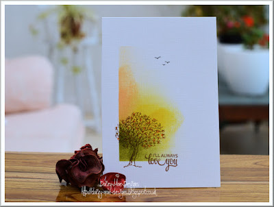
 Daizy-Mae (Viv)  
Autumn, Tree, CAS

We were literally swooning over the masking off to the corner, 
fabulous autumn colours, lots of lovely white space and 
hand drawn detail too!


 Sidan  

Using a slightly more restricted colour palette to capture autumn, 
wonderful combination of stamps gives lots of detail and interest, 
balanced by the white space above!


Linda W  

A real depth of colour, using the same inks for the background circle 
and for the beautiful leaves. Once again, the all important white space 
really makes the focal point work well.


Another brilliant selection and we're sure agree these cards are simply 
awesome and worthy of our ShowCASe this week.

Please take our showcase badge from the page at the top and 
we hope you'll display it with pride and our thanks.

If you are quick there's still time to join in this week's MASCULINE challenge, 
before we share details of the new one tomorrow at 8am BST, so join us then!

17 October 2015

Week 246 Theme

Good morning all!

Autumn has decidedly started to make an appearance here in the UK.
There's a definite nip in the air and the trees are really starting to show off their autumnal beauty! 
There were some lovely cards in our gallery reflecting this last week too.

On to this week and our theme is simply
MASCULINE

Here are our cards to give a little inspiration!


Anne

I've a die cut masculine card, with a Memory Box digger against a Memory Box sentiment.  The background was sprinkled with Brusho greens and then spritzed with water.  I coloured the digger with Copics and filled in its window with some Glossy Accents.

Here is a sweet Lili of the Valley image, gently coloured, set within a die cut frame and accompanied by a triple layered Penny Black die-cut sentiment. Although a masculine image, this card could be for either gender.
As I use double sided tape to adhere die-cuts, once stuck down, I sprinkled a little talc behind the part of the sentiment which overlaps the aperture so that it wouldn't get stuck to the picture when squished in the envelope.


Sarah
I can't resist a little space travel for guy cards and it's a first time use, 
for me, of this gorgeous Out of This World set from Clearly Besotted. 
Fun and Sci-fi! Using Distress inks in Ripe Persimmon & Wild Honey 
I inked a sun / planet. Then with Blueprint Sketch, Faded Jeans and Black Soot. 
I've added a few stars with a white gel pen, coloured the images with Stabilo markers
and mounted them on 3d foam, accented with wink of stella and glossy accents.


Anita

One for the younger men, as I'm always lacking in my stock of these cards. 
 I used a Nestabilities Rectangle die to cut out a piece of patterned paper from
 the Doodlebug Kraft in Color paper pad and adhered this flat to my card base. 
 I stamped the train from Clearly Besotted's Going Places set, die cut with its 
co-ordinating die, and then coloured it in with ProMarkers.  
The train was then popped up on 3D foam and the sentiment from the same set stamped below.


***


16 October 2015

Jewel Colours ShowCASe


SHOWCASE 
Week 244
We had some beautiful submissions for our jewel colour challenge and our showcase this week reflects the wonderful talents of our participants! 
As always it was a difficult choice!


Such a classy creation with touches of gold and the faceted heart was a perfect choice to showcase the ruby tones.


The abstract background stamp was ideal to create the diamond, and the embossing with the ink sprinkling created a wonderful result.


Christine created such a beautiful marbled effect with her alcohol ink technique which just popped against the wonderful white frame and die cuts.
We're sure you'll agree that all of these cards are simply stunning and so worthy of our ShowCASe this week.
Please take our showcase badge from the page at the top and display it with our thanks.
There's still a smidgen of time left to join in this week's one layer challenge, but a completely new one will begin tomorrow at 8am BST, so join us then!

10 October 2015

Week 245

Would you believe it... it's One Layer time again!
These months really seem to roll around quickly.

We have a really seasonal theme for your ONE LAYER creations this time and it's

AUTUMN

The leaves in our part of the world are just starting to change colour and when
we have clear skies and a little sunshine, nothing looks finer!

Anita

I masked a horizontal panel and blended various Distress Inks in autumnal tones.  I then took a leaf image from the Autumn Silhouettes set by Kanban, spritzed the stamp with water and then stamped on my panel one at a time, leaving the water to settle for a short while and then blotted with a paper towel to remove the colour.  Then, using second generation stamping I randomly stamped a small linear leaf image from the Mini Shadows set by Honey Doo Crafts in Walnut Stain Distress Ink.  After removing the masks I finished by stamping the tree and sentiment from the same Kanban set in Versa Color Pine Cone ink.


This Unity stamp is all about autumn to me:  wrapped up against the chill and with a warm cuppa!  She's coloured in autumn shades using Copics and I've added a House Mouse sentiment.


Here is a simple masked card, stamped with Stampin' Up's French Foliage stamps in a variety of Distress Ink autumnal shades. The sentiment is from Hero Arts. Autumn always make me think of thankfulness!


For this one I've gone with Autumnal colours rather than the usual 'leafy' images.
I started out by stamping and watercolouring my jug using distress inks in Peeled Paint
and Mowed Lawn before masking. Using my inky blending tools I've created the background
using: Autumn toned Distress Inks and to finish I stamped the floral silhouettes and
sentiment in Versafine black ink from Clearly Besotted: Simple Silhouettes.

We hope you enjoy the challenge and please remember to keep to the
Clean and Simple rules which are shown at the top right of the page.

***