30 April 2011

Week 13 Lucky Dip Thank you or Congratulations Plus Guest Designer

Last week you could almost hear the gasp of relief which swept around the world like a Mexican Wave, from all the LIMettes when they realised there was no acetate or one layer cards required for last week's challenge.

We have another goody for you this week too. As we wanted to thank you for all the support we have received from the inception of our blog and to congratulate you on the fabulous entries you submit each week, the theme for our Lucky Dip this week is 

THANK YOU or CONGRATULATIONS

This week we are joined by our first LIMited Edition, Guest Designer, who is a keen contributor and produces the most beautiful creations, so a big welcome to 
Kerry (Pickle)
Do visit Kerry's blog and see her fabulous creations.
For my 'Thank you' card I decided to go back to a DL (Double length) card. I stamped my curiously named Penny Black, 'Carefree Smiles' stamp,  onto green paper using Versamark, sprinkled it with Stamp and Bond and heated it gently to melt. I then added gilding flakes in Variegated Green, pressed them down, tapped off the excess and then burnished the rest with a textured sponge which I bought recently at the NEC. It was called a scoochie or something like that, I can't remember exactly.
I then over-printed the image with my Stampin' Up French Script background stamp in Gold ink.
The sentiment is an unmounted stamp and sadly I can't remember the make of it, but it's one of my favourites which I heat embossed in gold.
 I often use it masked to just say 'thanks'.
TIP... I cover part of the stamp with sticky tape whilst I ink it and then pull off the tape before stamping.
My Congratulations card is a simple Heat embossed Stampin' Up image, gently coloured with a Copic marker and highlighted with part of a Martha Stewart  punched silver border, which made me think of the bubbles from the champagne.Congratulations on your fabulous submissions...please keep them coming!

Mandi


For my thank you card I used Stampin' Up speciality papers 'Sweet & Sour' for the stripes and flower, plus some basic black cardstock. The flowers are a new die from the fabulous mini catalogue 'Fun Flowers' All available to purchase through me here.
To make the flower I used one large die-cut and  2 small ones cut from paper and 1 small from black card stock. I stuck the 2 small onto the large one and took my scissors' edge and curled the petals slightly. Then taking the small black flower I cut down from the 'scalloped' edges to the bottom of the petal shape, making 3 strips on each. I curled these and bent toward the centre, then stuck into the top small flower layer. I have added a 10mm black gem to the centre, which is hard to see on the photo, sorry.

Onto my congratulations card I firstly printed 'Congratulations' onto the card stock, Al Fantasy Type Font Available here Then I stamped  the Papermania glasses stamp and cut with a Nestie. I added the blue hydrangea flowers and pearls. I punched tiny flower heads and stuck to the bottom of the glasses, Lastly I added liquid pearl dots to the tiny flower centres and glass stems.  I did the same pearl dots for the bubbles but sprinkled with them with Glamour Dust glitter.
.


A little note on placement: I The glasses panel is off centre, then I made sure the flowers were mounted so that there is about the same distance from the edge as the nestie with the glasses, giving balance.
A huge thank you to all of you from both of us, for making our blog the super success it has become, we truly appreciate your support and we'd love you to visit our personal blogs ...we love comments too!.
Congratulations everyone!

23 April 2011

Week 12 - Recipe 'Off Centre'

Hello everyone and a Happy Easter to you all!
Yes, you are quite safe to look on here again, acetate week is officially over!
We were in raptures at some of the comments, although we did think that the suggestion that we should be burned at the stake a tad harsh...  but very amusing!
We think all in all you enjoyed yourselves in the end, some of you entering with multiple submissions... makes us think we may bring it back again later in the year....GASP!
OK so before we tell you about this week's challenge we told you last week about your name 'LIMettes' so we thought we needed a name too. Karen suggested 'Lady LIMs'
Mandi thought this suited Chrissie, but wasn't sure for herself. So LIM Diva Mandi evolved!

Our challenge this week should allow you to come out from your hiding places as it's an easy recipe

                           OFF CENTRE
We are looking for cards with little or no symmetry but perfect balance, which doesn't necessarily mean gems in all four corners, or any corners for that matter.

Mandi Diva LIM


Firstly, I printed the sentiment on the computer, judging the positions just 'off centre' by eye.
Fonts are Papyrus and Liorah
 Then to make the glitter 'stripes' I used a ruler and wedge glue pen, I simply took a ruler and drew a line, again judging the  length and distance apart. This was really random, as you can tell. The butterflies are Stampin Up Cut and emboss 'Beautiful Wings' You can buy here 
I cut/embossed 3 lots, Rich Razzlebury, Melon Mambo and Daffodil Delight.
They were attached with PVA and I added gems in black for the bodies, to tie in with the sentiment.


This was my first card, the 'off centre' started with the 3 hexagonal shapes, I then added the daisies and stamped 'Thank you' last of all.
Flower, Daisies from Stampin Up
You can buy here


To make this EMBOSS RESIST card... 
  • I first stamped the music manuscript in Versamark onto white card and heat embossed it using Fine Detail Clear Embossing Powder. 
  • Then I stamped the heart using SU Whisper White ink and heat embossed that, again using the clear EP.
  • Next came the sponging using a variety of red inks, Barn Door and Fired Brick Distress inks and Adirondack in Cranberry.
  • Rubbing over the embossing with a baby wipe removes any excess ink and makes the image ' pop' a little more.
  • The sentiment was computer generated using the method described in Week 3, using Champignon font for the script and Andalus for the type (I do have a stamp with this sentiment, but it was much too large for the proportions of this card, hence the computer generated one.)
The image was die cut and mounted using square Nesties

We do hope you are all happier with the challenge this week and can't wait to see what you create... so don't forget... 
'Less is More' 
Happy crafting

16 April 2011

Week 11 Theme - Acetate


We were delighted that so many LIMettes picked up the gauntlet last week and entered our most difficult of challenges... the One Layer Card. There were some stunning entries and the showCASe will be displaying some of last week's stunners very soon.
We would like to thank all those who visited our personal blogs and left comments, we really appreciated the time you took to do this and hope that you will continue to do so. Thank You all!

This week our challenge is to use

ACETATE

Don't groan in despair... all is not as difficult as it may seem. There are lots of ways of fulfilling our challenge this time. Even if you don't posses any acetate sheets there will probably some packaging which can be scavenged and utilised. Table confetti saved from that special dinner and wrappers from crafty items are all fair game in the crafting stakes. It can be painted with acrylics, spritzed with Glimmer mists, coloured with alcohol inks, drawn on with permanent markers, rubber stamped ... the list goes on and we're sure it will be added to by numerous LIMettes.

Here I cut some card slightly wider than the card back, scored and  folded it to make a square and then punched the edge of the flap with my Fiskars Upper Crest border punch. I then added the brown piece of card to the inner right hand side.
I cut a piece of acetate to the same dimensions, stamped the image and sentiment with white Stazon and attached it behind the punched flap.

I have another stamp of the same design, but slightly larger, it's bizarre, one is from Inkylicious and the other from Magenta, but the image appears identical. I used the larger one to stamp inside, on the brown section using a deep brown ink. I thought that this gave the impression of a shadow from the image on the front.


After much umming and ahhing, I decided to add a ribbon down the spine of the card, maybe you can decide whether it was the right decision... It can be easily slipped off as it is simply tied around the entire card and not stuck on

Here it is minus the ribbon....

.....Here you can see the sentiment


Using a piece of scrap plastic I punched out this butterfly and after dabbing with alcohol ink and then glue and glitter I added it to this fairly simple card. You don't have to add much acetate... just enough to be able to see it! (If you are going to use a punch, make sure it is fairly robust... we don't want you to break it and then blame us!)
If you have stopped groaning, it's over to me Mandi


I'm not one of those getting inky crafters, so luckily enough as I have boxes of OHP acetate I printed directly onto it on my laser printer. [Fairy Dots from Pink Petticoat]

I took a 6x6 white card, which I'd cut from a sheet of A4 [Folded in half and then trimmed 6cm from the short side, making a 6x6 base card] I trimmed 3cm from the open edge, then 3.5cm which was the 'space' for the flowers.  I then cut 6 flowers with a Sizzix Bigz die sold through Stampin Up 'Fun Flowers' You can buy here I set aside 3 of the flowers, then bent up the petals of the other 3. To attach the edges of the petals to either side of the space, I used a Zig glue pen, the type that goes on blue and dries clear. As you can see it's pretty much invisible once dry. 
I then stuck the shaped flowers to the centres of the 3 flowers and once dry [about half an hour] poked holes through the middles and tied my buttons. Amendment to post
** The flowers are what's holding the card and the end panel of card together, there is no acetate there, it's just the flowers, with space all round them. It's surprisingly strong! **
WOW, long explanation for such a simple card!
If you can't print directly onto acetate, you could stamp or colour with inks for a fabulous effect!

Good Luck this week, remember to think outside the box for the acetate, we are going to be pretty flexible!
But most of all have fun and a great week

09 April 2011

Week 10 One Layer Challenge - Sentiment Focus

What a bumper week we have had again...Thank you!
Along with Chrissie losing her laptop to the repairman for most of the week
and playing catch up from Tuesday evening, we were certainly busy little bees!
Before we tell you the challenge, you all have a new name!
"LIMettes"
Isn't is FAB, the super talented Sarah thought of it and we love it!
Chrisse, Mandi and The LIMettes...has a certain ring!

We thank you for your support of each other, leaving comments, we are getting big smiles from everyone enjoying double figure comments. We cheekily enough ask if you'd pop to our personal blogs too, we'd love to see you and thank you in advance for visiting us.

OK so without further ado here is the challenge
This will have your brains ticking over....

A One Layer Card with the SENTIMENT
as the focus of your creation.

Me first this week Mandi

Well I struggled myself this week!
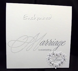
I had to use the computer to generate my sentiment as I don't own too many 'word' stamps!
I used the Young Love font here
I used text boxes for exact placement. The 'M' of Marriage is quite a bit larger than 'arriage' to create a focal point. Try it if you use this method! I then set the 'M' to outline and glittered with my Quickie glue pen.
'is everlasting' I wanted completely plain and used Century Gothic
'Love' again is young Love which I placed low enough to make the heart. To get the shape exact I cut my Sizzix Hearts and used the cut out bit as a template. Punched the tiny daisies and stuck in the heart shape. I placed the centre one first and gradually added one side then the other for exactly

 matching sides. Luckily they reached the bottom one together...skill ha ha


This alternative was my first attempt,  I think the pearls look a bit wrong somehow, but thought I'd show you anyway!
As you can see my one Layer is still just that, with a few additions, probably bordering on too many!
Hope you like them anyway...Good Luck I think you're gonna need it this week!


And now it's over to me Chrissie
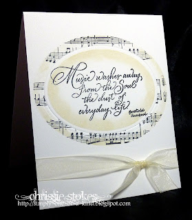
For my card this week, I tried to adapt a design I'd first  made as layered card, into a One  Layered version, and I have to say it was a much harder proposition than I'd originally thought,  involving embossing and lots of masking.

I began by embossing the oval on the card front, using a Nestie die, a magnetic sheet and my tan embossing mat.

  • I folded the card blank, turned it inside facing downwards and  placed one side of it on my Cuttlebug B plate (one side, the front in fact, was hanging out nearest me)
  • Next came the magnetic sheet, fitting snugly up to the fold of the card
  • Then the die, carefully positioned, cutting side uppermost
  • Next the piece of card which was hanging out was folded over the layers already arranged on the B plate
  • On top of this comes the tan embossing mat
  • Finally the second B plate was added and the whole sandwich was run through the Cuttlebug 
Once the embossing had been completed I then stamped the sentiment into the embossed oval.

The next part consisted of cutting masks using my Nesties for revealing the large oval surrounding the sentiment and another to mask the sentiment itself, whilst I used my SU Music Notes wheel to stamp the manuscript frame.
I sponged a little Distress ink in Antique Paper around the edges of both the frame and the sentiment panel while the die and the outer mask were still in position.
A little ribbon, and the card was completed.

One Layer does not mean plain and boring, small amounts of decoration are in order, twinkle and bling, embossing or a well chosen, subtle trimming can add much interest to a one layer card.

We really had to work hard on this one and we're sure it will be the same for you, but we know that you will rise to the challenge!

Enjoy the week LIMettes!

02 April 2011

Week 9 - Colour Challenge - A Touch of Red

You girls certainly keep us busy!
What a superb lot of entries we had this past week, with some truly stunning creations. We get the distinct impression that you are becoming much more comfortable with the CAS genre and lots are happily leaving areas of white space on their cards without anxiety!!!
Some people still have Word Verification enabled on their blogs and actually may not realise it, so once more we'll add WV at the end of a comment should we come across it. It makes getting round to everyone so much more difficult if we have to waste time either re-writing comments or working out the hieroglyphics!
SO PLEASE TURN OFF WORD VERIFICATION
Thank you!

Our prize this month is the book 'Handmade cards and gift-wrap' pictured on our sidebar and donated by New Holland Publishing.
More details about the book are on our PRIZES page. (Click on the heading at the top of our blog!)
This book is full of beautifully photographed projects to give ideas to the seasoned crafter and instruction for those less experienced.
It's full of hints and tips and has pages of photocopiable templates included, to help you complete some of the projects. It would make a fabulous gift or be a treat to buy for yourself.
Not only is the publisher donating a copy of the book to the winner of April's challenges, but is offering a 20% discount to readers of our blog. Click on the picture of the book on our sidebar to go diectly to the publisher's site.

Enter the discount code SLIM at the checkout to receive 20% discount and free P&P. (Offer only valid to residents in the UK!)
Offer valid until 1st September 2011.

This week we have a COLOUR challenge and what we would like to see is 
A TOUCH OF RED
Chrissie
For this card, I stamped the Magenta Stamps image onto the black card in Versamark and heat embossed it in gold. I then stamped the flower onto red paper and heat embossed that too, then proceeded to paper piece the flowers, by careful cutting out and sticking onto the black card.
A quick tip when paper piecing is to do just that... use paper and not card, as it will stick flush to the original and not be an obvious addition.
The flowers and the leaves  were then glazed with a Sakura pen.
The sentiment was from a Kolette Hall stamp where the words are arranged in a horizontal line, but I just chopped up the image to fit in with my design!

And now it's over to me Mandi
I had my undecided head on again as you can see!

I am so boring as I've used the Scriptina font again, but for me, nothing works better with this stamp
Stamp-It 'Audrey'
The other font is a standard plain one called Century Gothic
I stamped Audrey and 'coloured'  with Promarkers, Satin for the skin and Poppy for the shoes
Mounted one on red and one on black and added my rhinestone spacer.
Available here

I didn't have a large enough red gem so I cut a black circle of card, stuck in the base of the spacer, then stuck the smaller red gem to that!

My cards are 'DL - Double Length' as last week 8" tall x 4" wide

We'd love to see all your creations, so let's have another great week at "Less is More"


March Winner

We're delighted to announce our winner for March


Our reason for choosing Kathy, is her exceptional support of our challenge, both in entering her cards and for relentless commenting on practically all entrants! This is no mean feat!!
At the moment Kath is on holiday, but she is still leaving comments....amazing!

So THANK YOU from us, we do hope you enjoy your prize of $25

Please email us and we will give you the details to claim your prize