Showing posts with label Week 1-10. Show all posts

09 April 2011

Week 10 One Layer Challenge - Sentiment Focus

What a bumper week we have had again...Thank you!
Along with Chrissie losing her laptop to the repairman for most of the week
and playing catch up from Tuesday evening, we were certainly busy little bees!
Before we tell you the challenge, you all have a new name!
"LIMettes"
Isn't is FAB, the super talented Sarah thought of it and we love it!
Chrisse, Mandi and The LIMettes...has a certain ring!

We thank you for your support of each other, leaving comments, we are getting big smiles from everyone enjoying double figure comments. We cheekily enough ask if you'd pop to our personal blogs too, we'd love to see you and thank you in advance for visiting us.

OK so without further ado here is the challenge
This will have your brains ticking over....

A One Layer Card with the SENTIMENT
as the focus of your creation.

Me first this week Mandi

Well I struggled myself this week!
I had to use the computer to generate my sentiment as I don't own too many 'word' stamps!
I used the Young Love font here
I used text boxes for exact placement. The 'M' of Marriage is quite a bit larger than 'arriage' to create a focal point. Try it if you use this method! I then set the 'M' to outline and glittered with my Quickie glue pen.
'is everlasting' I wanted completely plain and used Century Gothic
'Love' again is young Love which I placed low enough to make the heart. To get the shape exact I cut my Sizzix Hearts and used the cut out bit as a template. Punched the tiny daisies and stuck in the heart shape. I placed the centre one first and gradually added one side then the other for exactly

 matching sides. Luckily they reached the bottom one together...skill ha ha


This alternative was my first attempt,  I think the pearls look a bit wrong somehow, but thought I'd show you anyway!
As you can see my one Layer is still just that, with a few additions, probably bordering on too many!
Hope you like them anyway...Good Luck I think you're gonna need it this week!


And now it's over to me Chrissie
For my card this week, I tried to adapt a design I'd first  made as layered card, into a One  Layered version, and I have to say it was a much harder proposition than I'd originally thought,  involving embossing and lots of masking.
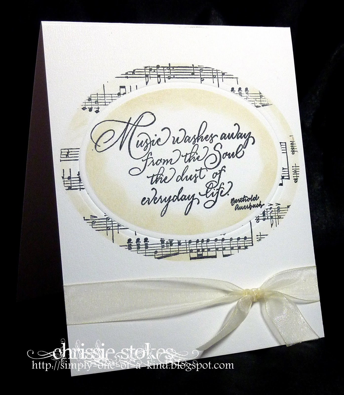
I began by embossing the oval on the card front, using a Nestie die, a magnetic sheet and my tan embossing mat.

  • I folded the card blank, turned it inside facing downwards and  placed one side of it on my Cuttlebug B plate (one side, the front in fact, was hanging out nearest me)
  • Next came the magnetic sheet, fitting snugly up to the fold of the card
  • Then the die, carefully positioned, cutting side uppermost
  • Next the piece of card which was hanging out was folded over the layers already arranged on the B plate
  • On top of this comes the tan embossing mat
  • Finally the second B plate was added and the whole sandwich was run through the Cuttlebug 
Once the embossing had been completed I then stamped the sentiment into the embossed oval.

The next part consisted of cutting masks using my Nesties for revealing the large oval surrounding the sentiment and another to mask the sentiment itself, whilst I used my SU Music Notes wheel to stamp the manuscript frame.
I sponged a little Distress ink in Antique Paper around the edges of both the frame and the sentiment panel while the die and the outer mask were still in position.
A little ribbon, and the card was completed.

One Layer does not mean plain and boring, small amounts of decoration are in order, twinkle and bling, embossing or a well chosen, subtle trimming can add much interest to a one layer card.

We really had to work hard on this one and we're sure it will be the same for you, but we know that you will rise to the challenge!

Enjoy the week LIMettes!

02 April 2011

Week 9 - Colour Challenge - A Touch of Red

You girls certainly keep us busy!
What a superb lot of entries we had this past week, with some truly stunning creations. We get the distinct impression that you are becoming much more comfortable with the CAS genre and lots are happily leaving areas of white space on their cards without anxiety!!!
Some people still have Word Verification enabled on their blogs and actually may not realise it, so once more we'll add WV at the end of a comment should we come across it. It makes getting round to everyone so much more difficult if we have to waste time either re-writing comments or working out the hieroglyphics!
SO PLEASE TURN OFF WORD VERIFICATION
Thank you!

Our prize this month is the book 'Handmade cards and gift-wrap' pictured on our sidebar and donated by New Holland Publishing.
More details about the book are on our PRIZES page. (Click on the heading at the top of our blog!)
This book is full of beautifully photographed projects to give ideas to the seasoned crafter and instruction for those less experienced.
It's full of hints and tips and has pages of photocopiable templates included, to help you complete some of the projects. It would make a fabulous gift or be a treat to buy for yourself.
Not only is the publisher donating a copy of the book to the winner of April's challenges, but is offering a 20% discount to readers of our blog. Click on the picture of the book on our sidebar to go diectly to the publisher's site.

Enter the discount code SLIM at the checkout to receive 20% discount and free P&P. (Offer only valid to residents in the UK!)
Offer valid until 1st September 2011.

This week we have a COLOUR challenge and what we would like to see is 
A TOUCH OF RED
Chrissie
For this card, I stamped the Magenta Stamps image onto the black card in Versamark and heat embossed it in gold. I then stamped the flower onto red paper and heat embossed that too, then proceeded to paper piece the flowers, by careful cutting out and sticking onto the black card.
A quick tip when paper piecing is to do just that... use paper and not card, as it will stick flush to the original and not be an obvious addition.
The flowers and the leaves  were then glazed with a Sakura pen.
The sentiment was from a Kolette Hall stamp where the words are arranged in a horizontal line, but I just chopped up the image to fit in with my design!

And now it's over to me Mandi
I had my undecided head on again as you can see!

I am so boring as I've used the Scriptina font again, but for me, nothing works better with this stamp
Stamp-It 'Audrey'
The other font is a standard plain one called Century Gothic
I stamped Audrey and 'coloured'  with Promarkers, Satin for the skin and Poppy for the shoes
Mounted one on red and one on black and added my rhinestone spacer.
Available here

I didn't have a large enough red gem so I cut a black circle of card, stuck in the base of the spacer, then stuck the smaller red gem to that!

My cards are 'DL - Double Length' as last week 8" tall x 4" wide

We'd love to see all your creations, so let's have another great week at "Less is More"


26 March 2011

Week 8 Sketch

Welcome to "Less is More" for the start of our new challenge.
What wonderful entries we had again last week. Even though we say it all the time, your comments blow us away and thank you so much for all the continued support.
Without you all visiting, entering and visiting each other, we wouldn't be where we are today...
proven by a few statistics!
We eagerly watch the Crafty Blogs [icon on sidebar] and we 'rose' to an amazing number 7 during the week. That is truly phenomenal!
On our very first week we had 167 entries and this has continued to grow and grow. The amount of comments you leave us is truly amazing and is what sets us apart from other challenge blogs we've come across. We also now have over 600 followers!
We both managed to still comment on all of you individually and will do as much as we can. Rest assured we will always both look at all entries even if you only get comments from one of us!
OK so onto this week,
 it's SKETCH week.


This was intended as a DL card, but although dimensions don't have to be exact, the proportions should be similar. (A tall thin card)
We have just learned from Lynne that DL stands for Double Length, so the card should have a height that is Double the Length of the width! Thanks Lynne.
You can interpret it however you wish but we do need to recognise the sketch and most of all your design must be clean & simple and most definitely
"Less is More"

And now onto our cards
Mandi first this week

Flowers are Stampin Up set Growing Green
stamped onto Pink Petticoat papers
Orchid pink and Pistachio and Fairy Dots [blk]
[With every pattern design you get the solid colour match too]
 Centre of green flower is black glittered and the 
gems are just stuck on the dot flower for a bit of interest
Font is Tall Paul


My little tut for this week is about matching a computer generated font to the colour in digi papers [or any scanned image in your computer files]
All digi papers are made up of a Red, Green and Blue colour palette,
so we need to determine what combination they are made of.
I do this using Paint as it's normally built into your computer.
On the start menu type Paint in the search box and open the program.
Then go to File 'top left hand side' A box appears select Open
From here you need to tell it where your particular paper is stored. Once you locate it, 
click Open and that paper will appear in the paint window
On the left hand side are 'tools' Select the little icon that looks like a pipette [3rd down on mine]
Click it onto the colour you want to match
Click Colors
Then Edit Colors [from a pop up box]
A box appears and click Define Custom Colors
There on the bottom right you will see, for instance
Red 231
Green 18
Blue 97
Make a note of these and you then change your font colour using these numbers.

This week I (Chrissie) have done 'his and hers' versions of the sketch.


Each card uses a heart from the Stampin' Up' I (Heart) Hearts' set of stamps and a background stamp also from Stampin' Up. The masculine version uses 'Friendly' and the female version 'En Francais'.

In both cases I have stamped the heart and then after cutting out, double embossed it with clear UTEE.

Each has a simple ribbon treatment.


The sentiment on the first card is from SU Vintage Vogue.


The sentiment on this card is a stamp from Penny Black.
The twiddly bit around this heart was made with a snipped up Martha Stewart border punch!


One of our community, Tara (Craftilicious) is starting a new Charity Challenge Blog with a DT selected from our number here at "Less is More"
This is what she writes...
  My father passed away 3 years ago from cancer was greatly supported by our local hospice, who I have been trying to support ever since through various crafting projects.  We have now started a crafting group at the hospice with the aim of coming up with craft-based projects to raise funds for them.  My first project is to start a charity challenge blog.  This will be a monthly competition to make a card and I am trying to encourage those who play along to post the physical card they make to the charities freepost address so we can have lots of lovely handmade cards to sell both in their shops and at crafting events we intend to put on throughout the year.
This challenge goes live on April 2nd and can be found here.
I'm sure lots of you would love to support this worthy venture!


We encountered many entries this last week, whose blogs still have Word Verification enabled. We would be really grateful if you could PLEASE TURN OFF WORD VERIFICATION , as it takes us so much longer to leave comments and we DO try our best to get round to everyone and with over 200 entries each week that's quite a lot of commenting!

We hope you enjoy the challenge this week and eagerly await your entries.

19 March 2011

Week 7 Theme Challenge - Masculine!

What wonderful entries there were last week and how very inventive you all are. It has been so rewarding to see so many participants submitting several cards as confidence grows and imaginations are sparked.  
It's practically a full time job for us to visit you all, but this week we were delighted to receive comments from lots of you on our personal blogs.We truly appreciate this and hope that you will continue to visit us.Thank you so much!

Our challenge this week is a 'bete noir' for many of us, so in the true spirit of challenges our theme this week is

A MASCULINE card

As ever, we would ask you to observe our guidelines above in creating your card for a man.

For this card, I used a stamp from the Stampin' Up Studio Sketches set, stamped in Chocolate chip ink onto ivory card. I wondered about inking around the edge of the image whilst in the die, but after consideration decided to leave it plain.
 This Spellbinders Label set (no 12) comprises 6 dies, each one just over 1 cm smaller than the next largest in the set. This gap seemed too large a border for my image to I decided to do a little inventive trimming.
Modifying Die cuts
  • Firstly I cut a spare shape the same size as the one for my image.
  • Next I cut the mount for my image using the next size larger die.

  • I attached the spare card to the mount using a dab of  re-positionable glue. I put it in one corner leaving the appropriate size border that I wanted for the finished mount on two sides.

  • Then I placed the same die I had used for cutting it, around the next corner using the spare card as a guide, and put it through my Cuttle bug,(corner to be cut facing toward the machine) and wound it through just enough to cut that corner and then wound it back. 

  • I then turned the card once more, placed the die around the next corner, and with that corner facing the machine just wound it through enough to cut that corner and then wound it back once more.
  • I repeated the process for the final corner.


I also did a bit of jiggling with my sentiment tags. Previously I'd never managed to get a mount for a tag, but using the same process I did it today.
    I stamped the sentiment, die-cut it with the appropriate gap on one side, then moved it along the die and re-cut, just winding through the Cuttlebug enough to cut one end then winding back!

    I did the same with the larger tag for the mount!
    You must excuse my badly scarred cutting plate, but it's seen a lot of wear!


    And now it's over to me Mandi

    Masculine cards are probably the ones we find most difficult.
    I have decided to show a simple option for those times we need to make a card where the man has
    no hobbies, doesn't like sport, doesn't drink! Yep aren't they a pain!
    Us girlies are so much easier to cater for eh!

    So what do we do for men!
    I think a bit of texture, pattern or colour goes a long way.


    I had originally decided on strips of textured embossed card in black and white, then as I was searching I found my Fleur de Lis [FDL] embossing folder and 'ting' remembered my FDL die cuts!
    And this happened
    So black or white....I don't know which I prefer, I keep changing my mind!

    The font I used is called
    Abaddon
    you can find it here

    A little mention about placement.
    The sentiment is off centre, and I placed the FDL off centre too, but bringing it in about the same distance from the edge as the Happy Birthday, giving balance
    For the white example, I offset the large FDL die cut, rather than placing the whole thing onto the card. It creates a different effect i think!


    As always we would like to to continue to visit fellow participants blogs to leave a friendly comment. With the growing popularity of our challenges, we are finding it increasingly difficult to get to everyone's blog, but we have just about managed to date. If numbers increase radically we may have to share the commenting between us and so your commenting will be even more welcome.

    12 March 2011

    Week 6 One Layer Card - "Off the Edge"

    Last week was another wonderful week for us here at" Less is More". We are so pleased that you are enjoying our challenges and would like to thank all of your for your kind words about our blog.
    Not everyone is managing to keep to our guidelines however and we have seen quite a few cards with many layers and little or no white space. It's hard to become accustomed to the genre, but so many people are becoming more comfortable with the Clean and Simple concept and are now enjoying their success.
    .....
    A few people have felt a little deflated by apparent negative remarks, so we must all be sensitive to the way in which the posts are written... it is sometimes a little difficult to tell if constructive remarks will be accepted with alacrity, but if constructive comments are invited, then it would be great to offer suggestions.
    We do not wish that anyone is offended or upset by any remarks which are made during the course of our challenges.
    On that note we invite you to comment on our cards on our own blogs too! Thank you to those that have done so, much appreciated
    .....
    Several  have expressed problems with photographing their cards. There is a FREE photo editing program available on line from Picasa here which  you can download and then drop your photos into to edit. There is even a button which is labelled 'I'm feeling lucky' so with the press of one button, your photo will be enhanced. There are more advanced features, so if you're having trouble, do give it a try
    ..... 
    Our challenge this week is that tricky one... the
      ONE LAYER CARD with the theme OFF THE EDGE
    We would like to see part of your image off the edge of the card. We have added the additional criterion of NO SCORED LINES.

    And now onto our cards


    This is one of my favourite stamps ever! It's called "My Mother's Dress' by Inkadinkado
    I printed the sentiment on the computer, was lucky and lined it up 'by eye' and it was in the place I wanted it!
    Then stamped the dress in black Stazon. As it was onto the dark pink card I didn't need to colour the dress. Instead I took a glue pen and added 'scribbled' lines to match the design and them sprinkled with Glamour dust. This is an effective technique if, like me, you aren't into colouring!
    The font I used is a free one called Jellyka, St Andrew's here I do love a scribbly font!
    ;Now a little tip about the  use of different  ink pads.
    This dress has a fair bit of intricate detail. Therefore the best ink to use is a dye based ink as embossing with a 'softer' ink pad, such as a pigment ink loses some of these details and becomes more solid.
    You can see by clicking the smaller pictures, just how different it can look.
    The bottom one was just something I was trying I stamped with Versamark, then heat embossed with 'Mother's Day pink' powder, then took my Brilliance dew drop ink pad and applied some white as shading. You could also get the same effect with chalks.


    For my card I used a Rollagraph Wheel floral stamp, which I bought at the last Show at the NEC and has remained uninked since. So I stamped using Versamark, starting just off the card at one side and rolling right off the card at the other side. Then I embossed it with white detail embossing powder. I had tried clear embossing powder in a previous incarnation (this is about my 5th attempt at getting this right!). Once embossed I coloured the flowers with  Stampin' Up inks in Baja Blue and Soft Suede using my water brush.
    If you squeeze a Stampin' Up inkpad together when it is closed, a small amount of ink is transferred to inside of the lid which can then be used like a palette. 
     For the sentiment I used Sahara Sand ink. The reason for using a lighter shade for this was to make it match with the deeper colour I had used for the flowers, but which had been diluted and lightened by using the water brush.
    To complete the card I added a few strokes of glue and a liberal sprinkling of Glamour Dust.
    Several people have commented on how straight this was stamped ... I did use a Stampin' Up Wheel Guide... not exactly cheating, just being sensible I guess!


    Keep checking to see who is in our ShowCASe this week. The photos will be added to the slide show and also on the ShowCASe page, accessible at the top of our blog.
    Have a great week, we are looking forward to seeing all your cards.

    05 March 2011

    Week 5 Colour - Pastel Colours

    What an amazing week, we can hardly believe the fabulous support our blog is receiving with a mighty 231 submissions. Thank you so much everyone!
     It seems that confidence is growing apace and sometimes second and third attempts are being submitted. It's truly wonderful how ideas are being taken on board via our mutual support, commenting  network, and lots of suggestions have been acted upon with very positive effect.
    There are still some participants who have not removed the Word Verification option from their blogs and we have had several requests from commenters about the difficulties that Word Verification present. I have discovered that some people didn't actually realise that their blogs were set up this way. For this week, if we meet a blog where the the Word Verification is still active we will put a WV in our comment just to draw attention to it. Don't forget that Blogger has an anti-spam filter and  you can opt for Blog owner approval, should you be worried about unwelcome comments.

    On to this week's challenge and being the first challenge of the month we are on to a colour challenge which this week is 

    PASTEL COLOURS

    This image was stamped with Versamark and coloured with Stampin' Up pastels in Almost Amethyst, Mellow Moss with a little Sage Shadow on the under edges of the leaves. The colour was applied with a cotton bud (Q tip). It was cut out with a slim oval Nestie and popped onto a larger one using dimensionals to give some relief. I didn't have any matching ribbon, so I coloured a piece of white ribbon with a Copic marker.
    The backing of the stripy paper is a Faux Nestie. I didn't have a die of the dimensions I required, so I cut my card to the size I wanted and then used a Nestie to hand emboss the edges.
    Faux Nestie

    • Cut the card to the required dimensions.
    • Insert one corner of the card into a corner of a Nestie, cutting side up.
    • Using an embossing tool, rub the card around the inner edge of the die, thus embossing the edge of the card.
    • Move the card around inside the die between strokes, until all the edges have been embossed
    And now it's over to me...

    Yes, I do have a fair bit of black on my card...we are allowing that!
    I think of  pastels a bit sickly sweet...
    adding black makes them more simply chic!!


    I stamped my circles, which are from the Stampin' Up Circle Circus set,
    then punched circles in different
    papers which I'd printed from Pink Petticoat.
    I used Blossom Fairy Dots,
    Pistachio Harlequin
    and Turquoise Pinstripes.

    I also punched a few daisies, which I put onto my foam mat and with an embossing tool, pressed into the centre of the flower. This technique makes the petals raise and makes for a more 3D flower. This is super for multi layers.
    The super swish 'bling' is a cupped jeweled edge embellie with a 10mm 'diamond' gem in the centre. I bought loads at a recent craft fair, as I LOVE them!

    So you will think, I've got a lot of embellishment on my card today... well you'd be right!!
    It's perfectly acceptable to have embellishments as long as the overall design is clean and simple!
    I finished the card off with a simple sentiment. I did wrestle with whether to add one or not, then decided one would fit nicely into the little area above the 'bling'. [Sorry it's the same one as last week!].

    As always we would ask if you could visit some fellow participants' entries and leave a comment. We were delighted to see so many words of congratulation for our February winner Jose, what a wonderful sense of community there is at "Less is More"! We are very grateful to you all!

    26 February 2011

    Week 4 Recipe Three Squares

    It's so nice to be greeted by faces and names that we are getting to know from your blog entries each week! We are delighted that we are developing into a group that is beginning to know one another, and we only hope that you will continue the great work of commenting on each other's blogs. We have been amazed by the quality of comments too. So often comments on challenge blogs are merely polite remarks about the DT examples, but here so many pertinent thoughts are being aired. SO many people have mentioned how much they have gained from this experience. Long may it continue.
    There are still some people who have not turned off Word Verification, we would ask you to do this please, in order to shorten the commenting process and enable us to visit more people!
    On to this week's challenge and this time it's a recipe.

     3    S   Q            

    For this card I used the Cracked Glass Technique
    • I began by stamping the (Joanna Sheen) butterflies  in Versamark onto white card and heat embossing with fine detail, clear embossing powder. 
    • I then sponged the images with SU Pretty in Pink ink using a sponge dauber.
    • Following this I used some SU Sahara Sand ink to sponge around the images.
    • Next I cut out the squares with a Nestie, deciding on the best angle for each one so that the three as a whole would  complement each other.
    • The script stamp came next, lining up the three images so that the angle of the script was consistent.
    • Then I stamped the whole of each tile in turn with Versamark and heat embossed them with clear  UTEE [ULTRA THICK EMBOSSING ENAMEL](2 layers for each tile).
    • The tiles were then put in the freezer for half and hour
    • When taken from the freezer they were bent into a curl and straightening them out and bending them in the opposite direction causes the cracking effect.

    You can see the effect in this close-up.

    And now it's me Mandi


    Ok so as you can see for my 3 squares I chose them to be different sizes.
    The first one in black, I stamped the image with Versamark then heat embossed it with Silver Dollar.
    This was to bring together the 'silver' of the diamante in the flower centre.
    The second square is in a pearlised textured card, to match the liquid pearls on the stamen dots in the flower centre. The last small square is embossed with the swiss dots which works with the silver!
    No technique, just placement really.

    For my flower, I stamped first onto the same white hammer card of my card base, then stamped 2 more images onto white vellum. Whenever I stamped a flower head I feel it looks better to be shaped, whether it has extra layers or not.
    I shaped the petals, some to the front [think you can tell on the enlarged piccy] some to the back, using my scissors and thumb. The card layer was only shaped slightly, but the other 2 are more so.
    I made sure I shaped all the petals the same way as each other on every layer.


    This is the card I made first, but, then made
    the black and white one.
    But, my buddy Chrissie says I should have still put this on too!
    So here you go......

    Papers are Pink Petticoat
    little tag is Stampin Up


    Last week we had 199 fabulous entries, thank you all, maybe next time we'll make the double ton!
    We have had one request for a tutorial on sponging, if you have any specific requirements do let us know... if we know how... we'd be delighted to pass on our knowledge!

    New cards only please....no back linking

    19 February 2011

    Week 3 Theme Challenge

    Goodness, last week was yet another glorious week  here at "Less is More" with so many amazing entries for this most difficult of Clean and Simple techniques.
    Some people commented that it was a very quick job to do. Some may find it easier than others...  speaking for ourselves, we both think it takes time to think about proportion and positioning, colour and the general composition of the card as a whole. It's not just a case of whopping a couple of stamps onto a card and saying it's done. We need to be critical of what we do if we are to achieve the best possible outcome.
    Some crafters have expressed a wish to become more comfortable with this type of card making and would welcome 'constructive criticism'. We are happy to do this, but would not wish to offend in any way at all. Sometimes the view of another person can focus one's own perception of one's work.
    Here is a comment we received from Jenny.
    "Great challenge girls and thanks for taking the time to visit and comment on both my entries. I am so glad there is someone out there who is willing to be constructive and not just say how lovely when something is so obviously wrong. My first entry wasn't right and thank goodness I was able to reduce the size and remove the HUGE word, it is now a C6 size and looks so much better. 
    Jenny x"
    Lorraine writes
    I really value your help and I would like to improve at this style :-)  I  would like you to always tell me as it is ,,, I don't need ,,, fabby card etc etc blah blah ,, lol ,, we can all write those lol :-) I really do appreciate criticism and would never be offended ,, :-) ,,, so please ,,, be as brutal as ya like ,, I can take it :-) ,,, and THANKS !!
    Lots of you have been absolute stars in visiting fellow entrant's blogs and getting to know our challenge community. We would urge you to continue to spend a little time doing this and even if it's only 10 visits, you would be making 10 people very happy! In order to save time and make commenting easier for those wonderful people who have commented on SO many blogs...


    PLEASE TURN OFF WORD VERIFICATION.
    You can do this by going to Design, then under the Settings tab click Comments and then click NO for word Verification. You can select Always for Blog owners approval should you be concerned about unwelcome comments.Thank you so much.

    On to this week and we have a Theme challenge... the theme is
    SPRING
    There are no other restrictions apart from the those in the guidelines for a C&S card.

    For this card I used a digi image from Fred She Said, coloured with Bundled Sage DI and a hint of Perfect Pearls Interference Green, used with a water brush. The sentiment was done on the computer.  Here is a quick tutorial on how I did it in Microsoft Word 2007.
    1. Click Insert and then click Text box and insert the appropriate number of boxes (for this I used 3, one for Spring, one for Blossom and one for the rest of the text)
    2. Divide your sentiment into components and write the parts in separate boxes
    3. Change the fonts to the size and style you prefer. [I wanted a mixture of script (Precious)and type (Calibri)]
    4. Highlight the boxes and click on Format and then the arrow on Text Box Styles
    5. When the box pops up drag the Transparency toggle to 100% and click OK
    Leave the box outlines in place at this time to allow them to be moved into position more easily.
    • When highlighted, the boxes can be moved around and overlapped and because of the transparency setting, the text will not be obliterated by another box.
    • I created spaces between the words in the typewritten section to allow for the risers and descenders of the script.
    • When happy with the positioning, (boxes can be fine tuned by highlighting and using the arrow keys to manipulate them) select all the text boxes together by holding shift and highlighting them, and when in the Format tab, click Shape Outline and select No Outline. If you right click at this stage and group the boxes, the sentiment will stay as a unit and can then be moved around the page.
    I popped the image into a text box too, so that I could place that exactly where I wanted it.

    and now it's over to me, Mandi...

    I too used the computer for my sentiment, using the 'text box' method.
    It's invaluable when you don't have the right stamp for your required sentiment!

    As you can see I have 2 cards to show you which I coloured!! not my favourite activity that's for sure lol

    The image is from Paper Garden Projects


    Fonts Used:
    Card 1 Juice ITC and Scriptina
    Card 2 Calibri and Jellyka Saint-Andrew's Queen
    Available from Dafont.com
    As you can see they are pretty much the same, I made the larger crocus one first, thought it looked 'wrong' and the second evolved. I then couldn't decide which one I liked best!
    Our lovely neighbour Jenny has one of them now as it was her birthday yesterday.

    The first thing I did was the sentiment. I tend to do this as it gives the base of the design.
    A little tip next..
    When I'm going to stamp directly onto the base of a card, I stamp the image onto a scrap piece of the same card to test how it stamps.
    In this way I discover whether a bit more pressure over all or part of the design is required and also to see how the card fares too. I often use hammer or linen textured and use the back of the card, which is the smoother side, to give even texture. I then roughly cut around the test image to check for placement on the card! Printed the font in black, the digi is outlined in black, then the line background also in black,
    which ties everything together. I stamped and coloured the images and added crystal glaze to the flowers as Crocuses are always 'wet' looking to me as they are so low to the ground and often in the damp grass!

    As usual we would ask you to link directly to your card not just to your blog and to link back to this challenge within your post.
    We can't wait to see your creations and do look out for the newly ShowCASed cards in the slideshow very soon.

      12 February 2011

      Week 2 One Layer Challenge

      What can we say?

      I don't think that either of us ever dreamed that our new venture would have sparked the imaginations of so many people. We are truly humbled by the support and response we have received for our blog and can only thank you all from the bottom of our hearts for the superb work you have shared with us this week!
      We would indeed be blessed if you all continue to support us in this wonderful way. 
      So a huge THANK YOU to you all!
      Now on to this week's challenge. If you bit the bullet to try last week's challenge, you're going to have to start chewing on it for this week's.

      The challenge is a ONE LAYER CARD with the theme of a 
      FLOWER or a TREE.
      Our definition of a OLC (One Layer Card) is on our sidebar and we would ask you to stick to these guidelines please.


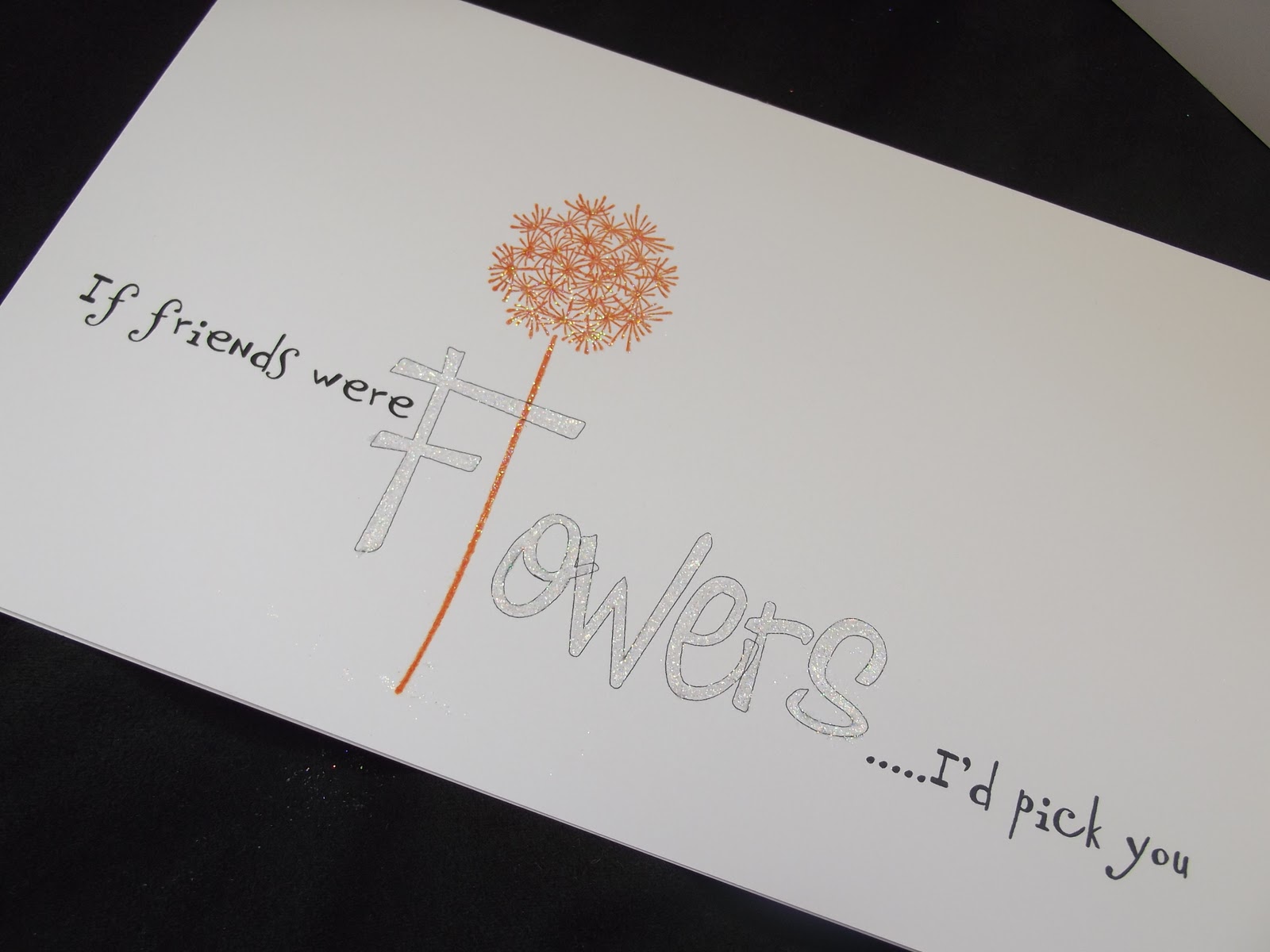
      Fonts used: Day Dream and Fabulous 50s
                I frequently use the computer for my sentiments and try to make them more attractive.

      Because I'm nit pickingly fussy had this not been a one layer challenge 
      id have cut the F so the stem went behind it! 
      So I thought I would show you a little tutorial for the different effects you can create. 
      This works especially well [I think] for the One Layer Cards.

      Ok so you print your word as normal,
      mine was Flowers [although I left a space where the letter 'L' should be for my flower].
      Then highlight to the word, as you would to change the size, colour or font.
      Go to the toolbar at the top of the page and click on the arrow to open the Font box

      *I can't give you a screen shot as there are a few 'Microsoft Word' variations, but, I'm sure you will follow what I mean, it's very easy!
                                            
                                                           In the Font box you will see Effects 
      in that section you will see Outline
      Check that box [Tick]

      You will then see that the word you typed will now be outlined.
      You can then use a Quickie Glue pen and Deco Art glitter...Voila!!

      I have shown a variation of a coloured outline, for a softer effect.
      To use a solid colour glittered also looks effective.

      Please click the small pics for larger images

      So that's my little tutorial for you.
      I hope you found it interesting...
      albeit not rocket science LOL.

        This technique looks great for Wedding cards.

       Try playing around with different fonts.


      More on font styling in the coming weeks...

      And now it's my turn!

      Chrissie

      My card uses a sponged background, made by die-cutting a sheet of paper to reveal a square hole and attaching it to the front of the card with lo-tack tape. (I used sticky tape that I tapped onto my sweater a few times to reduce the adhesive strength). Using this as a mask I sponged the card with several colours of ink using  sponge daubers. (SU Sahara Sand + Pumice Stone & Frayed Burlap  Distress Inks)
      This tree from Stampin' Up refused to be placed anywhere but in the centre of the square... I tried it overlapping the side of the square but its majesty refused to be placed anywhere but centrally!
      The Hero Arts sentiment was aligned using my Lego stamp positioner (see last week's tip). Both of these were stamped in Walnut Stain DI .
      The image box is positioned off centre and the sentiment partly aligned with the side of the square.

      At this point I would like to thank those of you who have taken the time to visit the blogs of fellow participants. Everyone loves to receive a comment and as there are only two of us it would be great if we could become part of a community where we take an interest in each other's work and each receive a few more comments. A big thank you to Deborah Frings here, who has visited so many of you. I do hope you'll pay her a return visit!

      There will be monthly prizes awarded to someone from among the contestants who have contributed to each challenge in that month. Prize details will be shown later.


      05 February 2011

      Week 1 Colour Challenge Pink, Black and White

      We are so excited and delighted to be starting our venture into the world of hosting Blogland Challenges.
      We have been truly overwhelmed by the interest and wonderful support from fellow bloggers for this new blog and now the time has come for you to show us your wonderful creations.
      When Mandi and I met for the first time, we felt like kindred spirits and got on well from the outset. Curiously we both wore pink and black so it was the obvious choice for our first Colour Challenge
      Your cards do need to be Clean & Simple; there is some information in the Glossary on the side bar if you're not sure exactly what this entails.

      Black, White and Pink


      Chrissie


      Both of these cards obviously use the same image, and have lots of 'white space' although the second one has the image matted on a smaller rectangle and mounted on a larger card. The basic design is the same on both cards, but any preference would be down to personal taste. Those crafters unafraid of large expanses of unadorned card may prefer the second, but don't be afraid to leave empty spaces on your cards, it helps to focus attention on the important elements.

      In order to position the sentiment exactly where I wanted it (essential when stamping directly onto the card), I used my DIY Stamp positioner. This consists of 4 large Lego blocks and a piece of acetate. The Lego is constructed into a right angle and the acetate cut into a square or rectangle. The piece of acetate is slid into the right angle corner of the Lego and then is stamped with the sentiment (fitting it snugly into the right angle in the Lego)
      The acetate image is then positioned over the card and the Lego fitted around the corner again.

      When happy with the position, keeping the Lego very still, the acetate is removed and using the Lego as a guide, the image is stamped onto the card.
      Voila!

      Mandi


      OK, so onto my card!
      As you can see there's also lots of white space...creating white space isn't actually any easier than filling every inch/cm with paper or card. It's all about the balance. The old 3 or 5 planting rule in the garden, also works on a card! That's something I cannot answer as to why it works, it just does!
      I had the idea in my head and started by creating the modern font on the computer. Regular followers of mine will know it's something I do often. So I placed the greeting off centre, then balanced the 3 circles on the opposite side. The large one off the page to make the eye think this wasn't just 'plonked' on!!
      I have glittered the damask pattern on the medium circle. CAS doesn't have to mean no detail, it just means simple lines and design. I added the 5 gems [notice that [darned] odd number again! but it still worked without it.
      I just do my utmost to add gems and or glitter to every card :)
      So that's me this week, I do hope all you followers will join in.
      We will give you every tip we can as the weeks progress.
      All we ask is that you enjoy taking part, and get to know the community we hope to create.